Gartner recently released a paper on Augmented Analytics which is described as “An approach that automates insights using machine learning, and natural-language generation.”
So as a gyani disseminating free gyan on the internet, I have chosen to write a few words on this.
This blog post of mine is an extremely biased and opinionated post. This is because any attempt to be fair and unbiased would not be thought provoking. We believe in clickless analytics and path to that includes learning and responding, predicting and suggesting, warning and solving. So, some of the points in this article may sound contrary to these but are not.
There are a few forms of viewing analytic which are taking the rounds, I want to address them briefly, and then I would love to get into more details.
An Unnecessary Story
I believe that nobody likes an unnecessary story. A narrative created from data which is normal without the context is a powerless narrative. The usually story like you walked 2% more than last month or your sales was up by 4% over the last quarter and 7% over the last month is as powerless as saying that the weather was warm on Sunday but it rained on Monday.
Data does not know the story. Your running data does not know about the weather and your work load. Your sales data does not know about GST and demonetization.
The result would be a misguiding narrative.
Even the regular business data which compares time periods is the least of the wonders from the analytics world.
One Graph too much
If your data to be viewed is not extremely large or extremely dispersed you do not need a graph. You may need a graph to just view large data, not analyse it. In the world where big data is the word for the season, we are looking at small aggregated data for real decisions. Let us take an example.
The total number of Wallmart stores is 4672, the SKU each store handles hovers around 150 000, the revenue totals US$ 482 billion. The person who wants to see the data for all 4672 store will not like to see the data per SKU in a graph. The person who wants to see the moment in SKU would need not see the data of 4672 stores.
Let us visualize the growth over a period of 10 years in the graph. What will be the next analysis the person will go to from this graph?
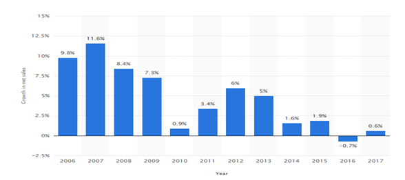
For example, will someone be looking for root-cause analysis will the person jump to another graph from here?
While the data remains humungous, the analysis is always in combination and contexts. Charts which has come to epitomize the analytics industry are not exactly what the people may be striving for.
Here the alternatives, which we are suggesting in the clickless world. We will write in detail about them and hope this is what may be the classic definition of Augmented Analytics.
- Fact Responder – Gives you single of multiple facts (data) about a question
- Pattern Browser – Responds to the questions by examining the data patterns in different ways
- Inconsistency identifier – Identifies inconsistency in sub set of data
- Solution provider – Yes, which customer is the best to sell to in the coming month
We looked at some parts of these in our earlier article. We will look at in-depth fact checking using natural language in the following article. Keep an eye for the Clickless series.


